
 |
| MATLAB: The Language of Technical Computing |
Welcome! Today's post is going to be exciting! We are going to finally use MATLAB to plot graphs!
Plotting of graphs is a fundamental step in mathematical analysis. Plotting a graph helps us visualize the function the graph is of. Hence we must learn how to do it at an early stage.
In this post, we are going to plot trigonometric functions like:
- sine
- cosine
- tangent
- secant
- cosecant
- cotangent
Plotting in MATLAB
To plot any function, first we need to define the range over which x varies. Y will always be a function of x. Hence y is defined automatically too.
Also, we need to display the corresponding values the axes represent.
For example x on x axis and f(x) on y axis.
With those things done, we put the title of the graph and bring an end to plotting the graph.
For example x on x axis and f(x) on y axis.
With those things done, we put the title of the graph and bring an end to plotting the graph.
Putting everything I told you above together, lets put down a sample graph with just the values discussed above with the following commands:
 |
| General Graph Plotting syntax |
In the above snippet of the Command Window, we defined the range of x first. We defined its range from negative PI to positive PI.
Then we labeled the axes with X Axis as 'x' and Y Axis as 'f(x)'. Finally we gave the graph a title as 'f(x) graphed between -pi to pi'. Notice that \pi is the combination required to represent -pi as the greek letter pi. In technical terms, this is called the TeX Markup.
We can see the plot produced above below:
And with that, I'm sure you must have got a feel of plotting graphs in MATLAB. Hence lets get started with our trigonometric functions!
Then we labeled the axes with X Axis as 'x' and Y Axis as 'f(x)'. Finally we gave the graph a title as 'f(x) graphed between -pi to pi'. Notice that \pi is the combination required to represent -pi as the greek letter pi. In technical terms, this is called the TeX Markup.
We can see the plot produced above below:
 |
| Sample Plot |
And with that, I'm sure you must have got a feel of plotting graphs in MATLAB. Hence lets get started with our trigonometric functions!
Plotting sin(x)
To plot sin(x), we use the following commands:
 between -pi to pi") |
| Plotting sin(x) between -pi to pi |
As we can see, the general procedure remains the same. We:
- Defined the range of x. x will take those values, with the interval between two consecutive values being 0.1.
- defined y as a function of x.
- gave the statement to plot both x and y after defining their range.
- labeled the axes correspondingly.
- gave a title to our graph.
") |
| Graph of sin(x) |
The above set of statements will remain the same for all of the plots. Hence for the next plots, I'll just give out the commands and their respective plots without the explanation of the procedure as the procedure will remain just the same, just the one we followed above for sin(x).
Plotting cos(x)
Commands used:
 |
| Plotting cos(x) between -pi to pi |
And the plot produced hence is:
") |
| Graph of cos(x) |
Plotting tan(x)
Commands used:
 between -pi to pi") |
| Plotting tan(x) between -pi to pi |
And the plot produced hence is:
") |
| Graph of tan(x) |
Plotting sec(x)
Commands used:
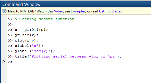 |
| Plotting sec(x) between -pi to pi |
And the plot produced hence is:
") |
| Graph of sec(x) |
Plotting cosec(x)
Commands used:
 between -pi to pi") |
| Plotting cosec(x) between -pi to pi |
And the plot produced hence is:
") |
| Graph of cosec(x) |
Plotting cot(x)
Commands used:
 |
| Plotting cot(x) between -pi to pi |
And the plot produced hence is:
") |
| Graph of cot(x) |
And yes, with that we finish our today's lesson. I hope you learned something out of it. Learning how to plot functions in MATLAB is really important as this skill is a pre requisite of many advanced applications of the language. So with that, I finish this post. Take care and Good Bye :)
0 comments:
Post a Comment